

What explains the disparities in the spread of COVID-19 in New York City? It is not density.

When John Snow created a detailed map of cholera cases in London during the outbreak of 1866, he observed patient homes were clustered around a few water pumps. This mapping exercise not only resulted in identifying the source of contamination but also prompted reconsiderations in sewage systems and water quality examination to prevent future outbreaks. Mapping cases of COVID-19 in New York City brings to the surface one of the most significant issues in the city: economic and social disparity.
New York City is at the center of the COVID-19 crisis in the United States. As of May 22, 2020, more than 200,000 positive cases have been reported in the city, about 11% of all cases in the United States. Officials, journalists, and scholars have offered two main explanations for this high infection rate in New York City: high density and rates of public commute. In an earlier article, we looked at these two factors and their impact on the infection rates on the county level to evaluate these hypotheses. Our analysis verified that density beyond a level, or what we call hyper-density, can increase a city’s vulnerability during a pandemic. However, an early response to the pandemic can be highly effective in controlling the spread of the virus in dense cities. For instance, while San Francisco County and Queens County have comparable density and public transportation rates, early lockdowns in San Francisco county effectively contained the spread of the virus. Other high-density metropolitan areas in the United States and across the globe have taken policy measures that have effectively curbed the spread of the COVID-19 virus.
In the past few weeks, several counties have released zip code level data for COVID-19 cases. This data allows us to look within a city and analyze the relationship between the infection rate and environmental and socio-economic factors. Also, since we don’t have to account for policy differences between different states and cities, a more controlled study is possible.
Let us start our analysis by looking at density. New York has the highest density among all American cities and Manhattan has the highest density among all New York Burroughs. However, some of the densest zip codes in Manhattan are among the least-infected areas in the city. In contrast, some of the zip codes within Queens and Bronx with much lower density have some of the highest infection rates. A linear regression analysis shows that density and number of cases are negatively correlated in New York City (p<0.01; R-Squared = 0.24).
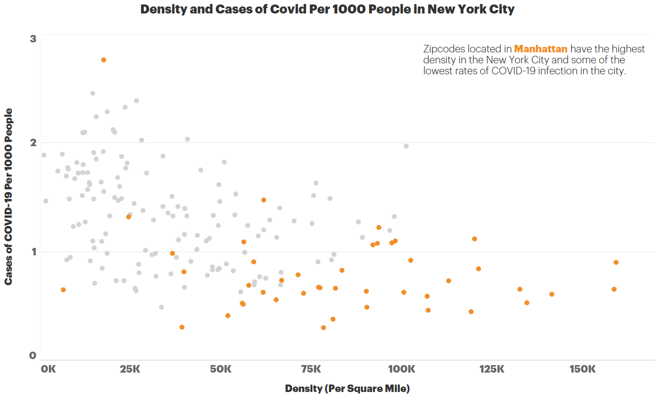
This negative correlation does not mean that lower density accelerates the spread of the virus. There are other differences between Manhattan and Queens besides density. The most evident one? Education and income.
The infection rate drops considerably with the increase in the education level. In zipcodes where less than 30% of the population has a college degree, there are on average 13.4 cases of COVID-19 per 1000 people. All but 2 of the zip codes in the Bronx fall into this category and not surprisingly all zip codes in the Bronx have an infection rate of 1% and higher. In sharp contrast, the infection rate is 8.4 per 1000 in zip codes where 30–60% of the population have college degrees and 5.6 in zip codes with more than 60% college-educated population. The lowest education bracket has almost 2.5 times higher infection rate compared to the highest bracket. All zip codes with a college degree per capita of 60% or more are in Manhattan. Infection rates and college degrees per capita are negatively correlated in New York City (p<0.01; R-Squared = 0.37).

Looking at the income levels, again we can see a clear divide in the infection rates between higher and lower socioeconomic regions of New York City. Areas, where 30% or more of the households earn $54k or more per year (median in New York), have almost half the infection rate compared to the ones below this threshold.

In summary, socio-economic factors are better indicators of infection rate in New York City compared to density.
People in low-income zip codes live in overcrowded apartments, work in essential jobs that can’t be performed remotely, and ride the subway to get home. The disparities can be also partially explained by the fact that the population living in high-income neighborhoods started leaving the city as early as March 20. This magnifies the connection between affordability and access.
This pattern of disparity is evident in other health measures. Although clinical care has often been the primary focus in healing from illness, what decades of public health research have shown is that there are many aspects that determine one’s health status. Factors like education, income, housing and homelessness, access to public space, access to healthcare, insurance, cultural diversity and sensitivity, remoteness, and many environmental factors can all contribute to the disproportionate health outcomes experienced by underserved communities. These have been particularly evident throughout the COVID-19 pandemic in the US.
This disparity is not a surprise, but the data has vividly unearthed that the call to action is not just equality, but equity. Many policies, guidelines, and procedures create one-size-fits-all band-aid solutions with the intention of ‘leveling the playing field’. While those efforts are commendable, they are not granular in their context. The Robert Wood Johnson Foundation’s work on County Health Rankings reveals data showing a persistent pattern in barriers to opportunity for people with lower incomes and for communities of color across the United States. Patterned differences in a range of health factors emerge from unfair policies and practices at many levels and over many decades that are avoidable. These differences are further augmented by the physical environment. A robust body of public health literaturesuggests that disease prevention and public health promotions are more effective when approached with an ecological perspective as its key strength lies in factoring multiple levels of environments in behavioral and health outcomes. Solutions to problems in access to care and design of the physical environment should include the distinct nature of each community and every aspect must be contextual and appropriate to the population being served.

The illustration exposes the difference between an approach that aims to achieve ‘equality’ (in the left) versus one that targets ‘equity’ (in the right). A built environment that is designed with ‘equality’ in mind assumes that a successful strategy in one geography and demography should exert the same success in another. However, when ‘equity’ becomes the goal, the strategies are proportionally adjusted using a microscopic lens as evident in the ecological model.
The ecological model considers various environments around a target behavior encompassing individual and interlinked micro-level physical environments, larger environments nesting such micro-environments (e.g. neighborhood nesting individual dwellings), infrastructure, and resources, and social norms and societal values in addition to predisposing factors (e.g. biological factors and individual background). This means that there is a gap between a leveled playing field and a playing field that intentionally undulates to give just the right boost to fill the gaps and make outcomes like enhanced public health more reachable.
Urban Design can address that gap.
A contextually sensitive design thoughtfully leverages a toolkit of equitable open space network, complete streets, pocket parks, place-specific incremental coding changes, aging-in-place, mixed-use, affordable housing, etc. at a microscopic scale. The ‘boost’ required to fill the gap in a higher density, ethnically diverse community is different from what is needed in a sprawling neighborhood marked by unemployment. Similarly, an area where the top health risk is Type 2 Diabetes has the opportunity for the built environment to be articulated differently than one where the top risk is Asthma. General policies and codes will not suffice if they are not customized, even if they are relevant.
The lessons from zipcode specific data empower us as thinkers and doers who shape the built environment. COVID-19 presents Urban Designers with a platform to test a toolkit that will connect the nature of a place with its ability to not only be resilient in times of crisis but also thrive in whatever definition of ‘normal’ defines our todays and tomorrows.
Authors:
Babak Soleimani, Ph.D., Data Scientist, HKS Inc.
Sheba Ross, AICP CUD, CDT, International Assoc.AIA, Senior Urban Planner and Designer, HKS Inc.
Yiselle Santos Rivera, AIA, LSSYB, LEED AP BD+C, WELL AP
Firmwide Director of Equity, Diversity & Inclusion, HKS Inc.